VELA
Personalised surf spot recommendations based on ability level and preferences.

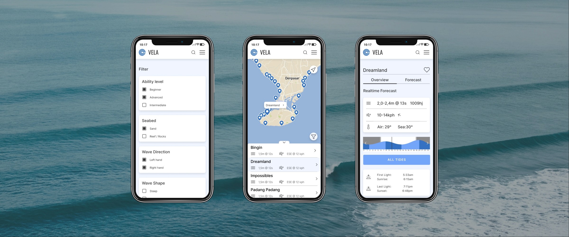
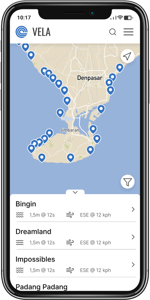
Home Screen

Filter

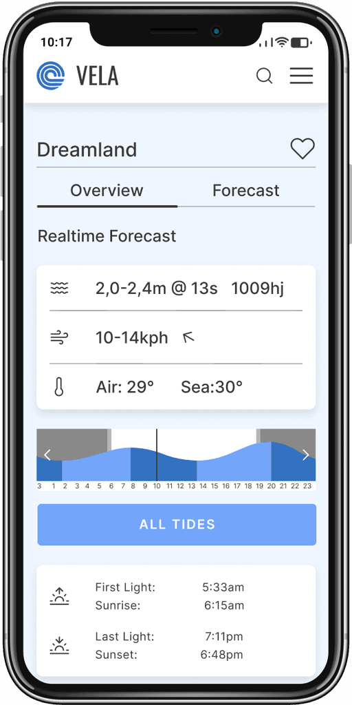
Spot Overview

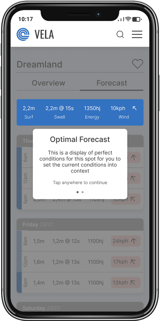
Onboarding

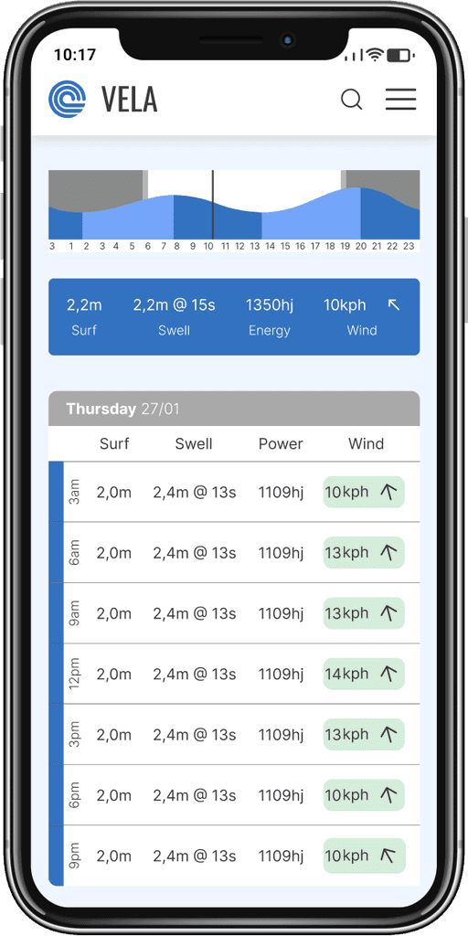
Forecast

Favourites List

Home Screen

Filter

Spot Overview

Onboarding for Rating

Spot Forecast

Favourite Spot List

Background

Vela is a surf forecast web application that lets users set spot filters, based on their ability level and personal preferences, to get personalised recommendations for surf spots around them.

Intro

Vela was my first end-to-end design project and part of my UX design studies, but my motivations came from a different place. 


For about two years of my life, lived in a camper van, and surfed as much as I could.


During that time I experienced a lot of people struggling with reading surf forecasts and getting valuable information from them.


Most people would just go wherever their friends would go, or get a recommendation from the local surf school, even if that surf spot was not ideal for them.


Before I could come up with a solution, I had to find out why it was such a big problem, what needed to be changed, and how I could help them.

Exploring the problem space

Before doing user interviews, I wanted to get a good understanding of the current state of forecast providers and analysed the two leading surf forecast sites.


I found that the more information is displayed, the more confusing the interface gets.


Although a "wave alert" exists, it is not personalised at all and more of a generic "there are some waves" notification.


With Vela, I will try to display all important data in an easily digestible way, with the option to get more thorough information if needed.


With this information, I drafted a problem statement and wrote out 13 interview questions to ask participants in user interviews.

Home Screen

Filter

Spot Overview

Onboarding for Rating

Spot Forecast

Favourite Spot List

Background

Vela is a surf forecast web application that lets users set spot filters, based on their ability level and personal preferences, to get personalised recommendations for surf spots around them.

Intro

Having lived in a camper van, and surfing a lot myself, I have seen many people struggling with getting valuable information from surf forecasts.

Exploring the problem space

I did a competitive analysis to understand the current state of the market and found that the more information is displayed, the more confusing the interface gets, and that no site offers any personalised recommendations.


I then drafted a problem statement and wrote out 13 interview questions to ask participants in user interviews.

Problem Statement

"How might we provide users with personalised recommendations on surf spots around them, as it is hard to know where to go based on raw weather data, especially when not experienced in reading surf forecasts."

User Interviews

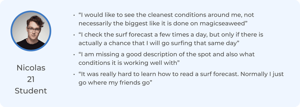
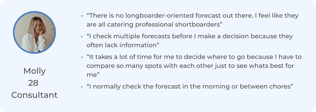
The interview participants consisted of three people, from the age of 21 to 54, each using surf forecasting sites regularly.

I wanted to find out:


  1. What problems they have with the sites they are currently using 


  2. How easy it is for them to understand the forecast information and what would help them to understand it better


  3. What situations they are currently using forecasting sites in

Findings

Most people have trouble getting valuable information from raw forecast data, as setting it into context without a detailed spot description, including the optimal conditions for that surf spot is difficult.


Users also miss the ability to set a filter with personal preferences, or their ability level, to get personalised recommendations on surf spots.

Defining the problem

Users need a way to receive personalised recommendations on surf spots based on their preferences, and a detailed overview of each spot including an “optimal conditions” display.


These are features none of the competitors currently offer 

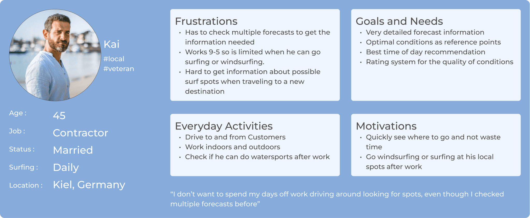
User Personas

I created one user persona for each extreme use case. One experienced surfer, who needs to see very detailed forecast information, and one surfer, who needs a lot of guidance in finding the right surf spot.

Ideation

As I had a good understanding of the users, the content, and the context, creating the Information Architecture was next up.

Prototype

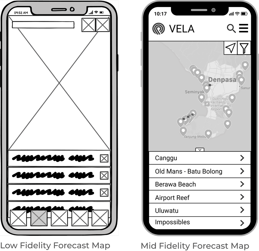
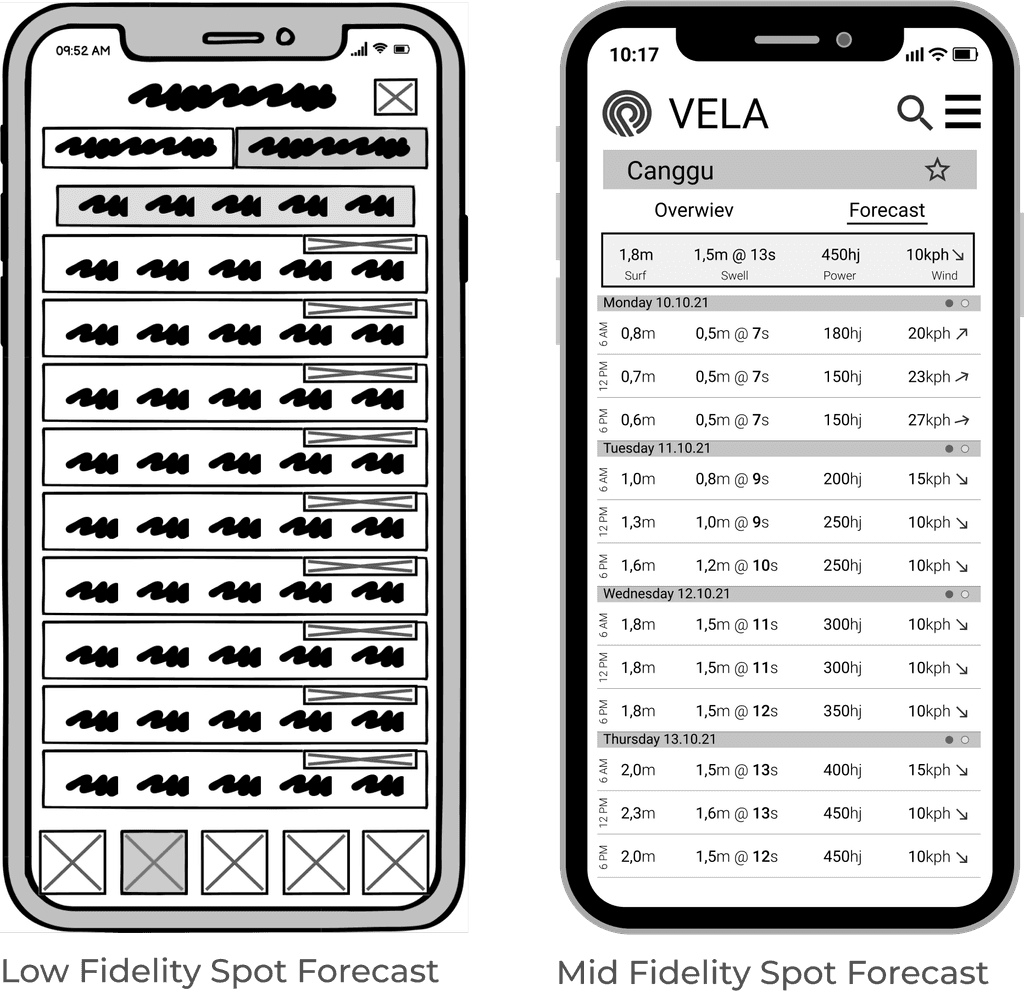
With clearly defined goals and a solid structure, I drew up the first low-fidelity wireframes, iterating, and turning them into a digital and clickable, mid-fidelity prototype and prepared for usability testing.

Test, Test, Test

I wanted to observe the learnability and intuitivity of Vela with first-time users and see where, and what kind of error occurred.

Objectives: 


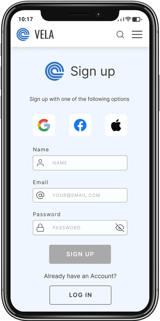
  1. Observe participants while creating an account to see if I can streamline the process


  2. Measure how successful users are at setting their preferences in the filter and receiving recommendations for surf spots


  3. Identify problematic areas and possible improvements of the navigation structure to increase learnability


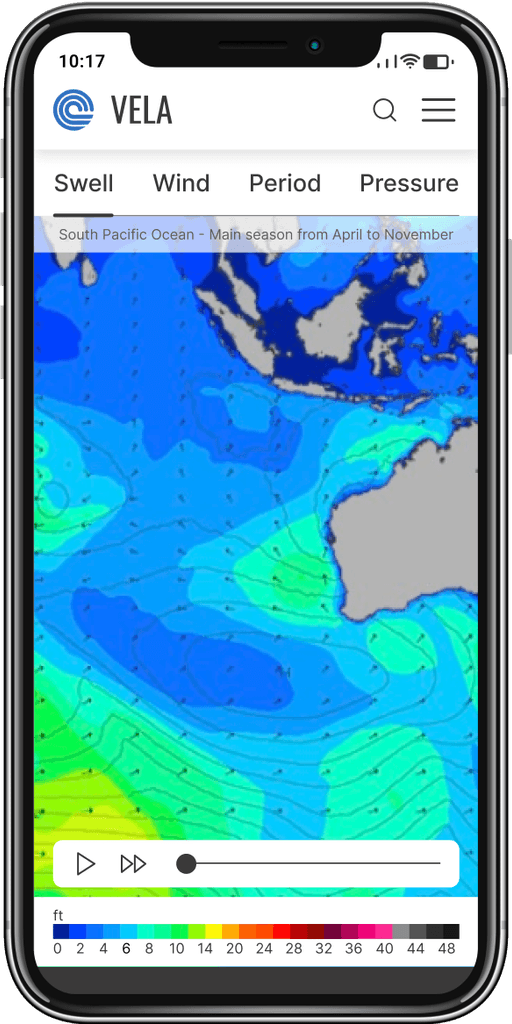
  4. Assess if I can improve the way forecast information is displayed to make it easier to understand for users


Issue 1

Description:

Users can not identify the filter button


Severity:

High


Solution:

Move the button to a more highlighted location


Evidence:

66,7% of participants had trouble finding the filter feature

Issue 2

Issue 2

Description:

Users want to create an account in the login screen


Severity:

Low


Solution:

Clearly divide login and signup process, taking inspiration from bigger companies like Google


Evidence:

33% of participants tried to create an account on the login screen

Issue 3

Issue 3

Description:

Users want to find surf spots by using the search bar instead of the map, therefore not being able to set the filter


Severity:

Medium


Solution:

Turning the spot map into the home screen, users are immediately prompted to use the filter on the map while still being able to use the search bar to look for specific surf spots


Evidence:

33% of participants tried using the search bar instead of the map

Designing for good

During the process, I collected frequently used components, fonts, grids, icons, and colours, and created a custom design system, which you can take a look at here.

Try it out yourself!

What I have learned

As this was my first end-to-end design project, I have learned to trust the process. That said, this was not my most important learning. I realised how important it is to fully understand the people you are building this product for. It is their problem you are trying to solve and their pain points that motivate you in finding solutions. I have also realised how much I love helping people achieve goals and how fulfilled I feel when something I have built helps them in doing something they love
Have a look at my other projects

Get in touch

Like what you see?

Let's talk about your project next!

Get in touch

Like what you see?

Let's talk about your project next!

Get in touch

Like what you see?

Let's talk about your project next!

© 2022 Oscar Horn Design OÜ. All Rights reserved