Work Collection
Zwopr
Overview
Zwopr is a german startup that started out as a platform for community support for neighbours but turned it's focus on employee retention. They now offer a platform in which ambassadors from inside the company are in charge of creating corporate events that motivate employees and help form meaningful connections.
Approach
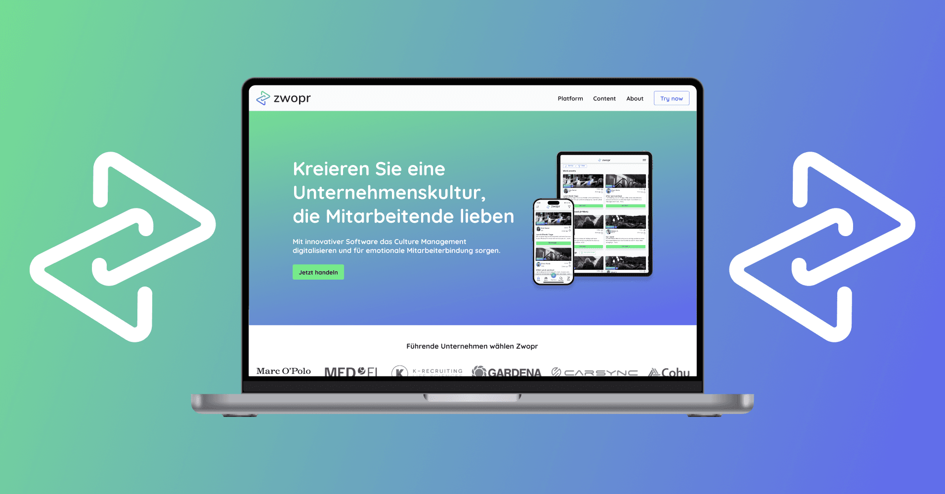
My task was to give the brand a complete visual redesign including the logo, full branding guidelines, visual public presentation, and mockups with the new guidelines in place. My goal was to create a modern, engaging and inviting brand that only had a hint of the old guidelines left.
Branding Guidelines
The original brand colours were a very harsh shade of green and a dark blue. To give the site a more engaging and modern feel, I went with a mellower shade of green and paired it with a strong, yet calm shade of purple.
Colours
Primary Colours

Secondary Colours

Gradient

Typography
Logo Design
I took the first letter of the brand name as the base of my logo design process.
Starting with a "Z", I connected the open ends to create two opposing triangles.
I then offset them to overlap, rounded the corners and opened them back up to make them look like they are interlocking and part of one instead of two separate units.
In the last step, I rotated the design to move away from the "Z" and create a logo consisting of two interlocking elements that create one, whole unit together.
This goes well with the company's mission to connect people and help create relationships.


Final logo and variations


Applied Guidelines

What I have learned
I have learned to create something new based on an existing product with a loyal user base. As I had to bring fresh wind and a modern feel into the company's appearance, while keeping it recognisable to existing users, I needed to fully understand what the company stands for and is trying to achieve with their product before setting out to design any assets. The project was a really fun experience and made me more aware of certain metrics in regards to branding and colour psychology than I was before.